
What if you had a superpower — like X-ray vision — that let you see how many people logged into Facebook each day?
This X-ray vision could be used on any company. On any given day, you could see how many people:
- ate at Chick-fil-A
- shipped packages through UPS
- made a purchase at Best Buy
In short: imagine if you could see the daily customers for any company, in real time.
Public companies sometimes share this data, but it’s usually buried in lengthy annual reports, scrubbed by the internal PR teams, and pretty much useless by the time investors get it.
This X-ray vision would let you see customers in real time. Can you imagine how powerful that would be?
You could compare companies against each other, watch for long-term trends, or how see supply chain shocks affect sales.
It would be an investor’s secret weapon.
With blockchain, of course, we have this X-ray vision. It’s called Daily Active Users, and today I’ll show you how to use this secret weapon to make even better crypto investments.

More users = more value
In the world of crypto, users drive value.
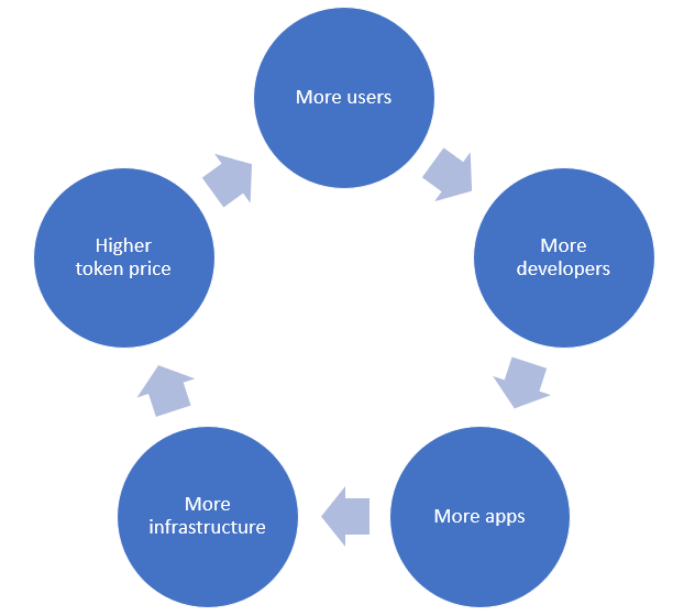
This is because of network effects: the more users on a blockchain, the more developers. The more developers, the more apps. The more apps, the more users. And so on, in a virtuous circle.
Along the way, you get all kinds of second-order effects: better developer tools and education, increased brand recognition, more crypto exchanges supporting the ecosystem.
Just look at Ethereum and the recent success of the enormous ETHDenver event: once you get the snowball rolling, it starts to pick up speed. That’s network effects.
This is what network effects look like, in real life.
The #1 most important metric for a new blockchain investment is number of users. Not price. Not market cap. NUMBER OF USERS.
Say it with me: I will research the number of users before I make any crypto investments.
A terrific tool is Glassnode, where you can see real-time stats on the Daily Active Users for top tokens. It’s incredibly eye-opening.
You can’t fake Daily Active Users. (At least, not for long.) It’s like having X-ray vision: You strip away the hype, and get to see the blockchain completely naked.
There are a few ways to look at Daily Active Users:
- Comparing across tokens
- Trends over time
- Users vs. price
Let’s take each of these in turn.
Method 1: Comparing DAU Across Tokens
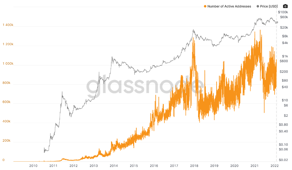
Here’s a look at Daily Active Users of bitcoin (DAU = orange line):
Now compare it with Ethereum (DAU = blue line):
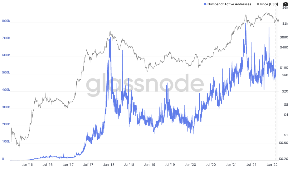
The first thing I noticed was that bitcoin has 1M Daily Active Users, where Ethereum has only 500,000. Did you know that? I didn’t. With all the DeFi activity, I thought Ethereum had more users.
Now let’s compare it with a DeFi token like Aave:
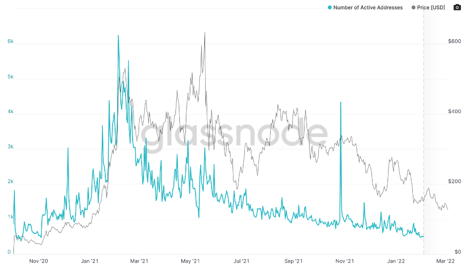
Here we have only about 500 active addresses a day. (You read that right.) Comparing Ethereum vs. Aave is like comparing Amazon vs. a local grocery store.
When I say “more users = more value,” I don’t mean that more users means higher price. You can see from these charts that price (the gray line) often moves in mysterious ways.
However, over the long term, users drive value, so user growth will generally correlate with higher token price (just as in a traditional company, customer growth will generally correlate with higher stock price).
So in plain English: if you see Daily Active Users growing over a period of several months, that’s a potential winning investment. If it’s on the decline over the same period of time, watch out.
Method 2: DAU Trends Over Time
You can see the health of a blockchain (like the health of a business) in real-time. Consider Balancer (BAL), which was the talk of the town a few years back. Auto-rebalancing portfolios! Say goodbye to fund managers!
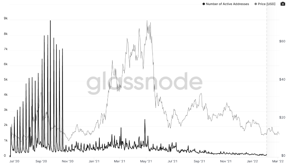
Today the BAL token has somewhere around 100 Daily Active Users. That’s pretty bleak. Compare that with the Daily Active Users for Brave Attention Token (BAT), the token built into the Brave browser:
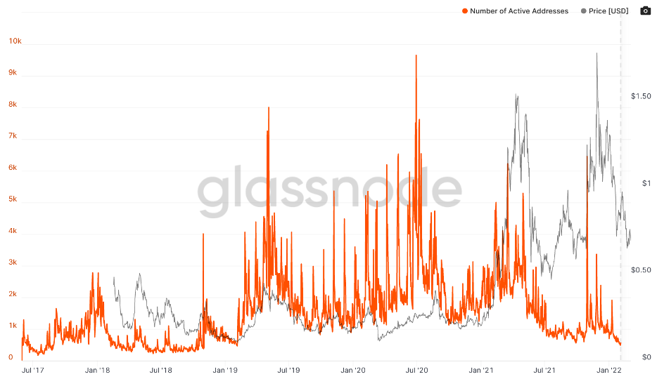
Here we see much healthier growth over time (though we should ask what happened in July 2021, and whether BAT will recover). Note also the regular spikes in usage, suggesting BAT is really being used to pump value at regular intervals, like a heartbeat.
If these two charts were your starting point as an investor, you could say that BAL is probably on its way out, and BAT just may be worth a deeper look. (For further research, you can then use a tool like our peer-reviewed Blockchain Investor Scorecard).
Method 3: DAU vs. Price
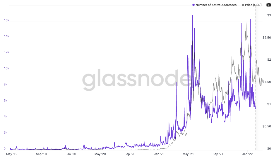
Finally, we can look at Daily Active Users vs. Price to see if they are moving in lockstep, like Polygon’s MATIC token:
Or if it’s more out of sync, like Uniswap’s UNI:
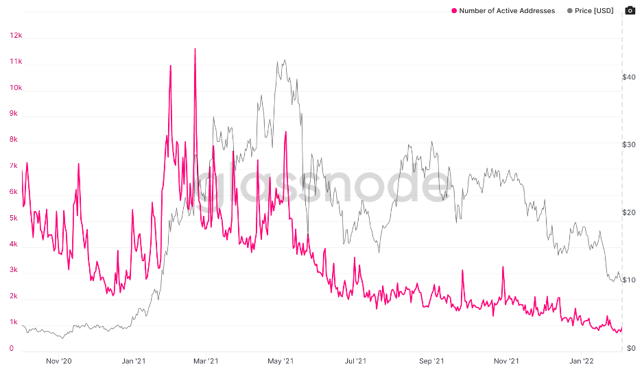
To be clear, price and users don’t need to be in perfect unison. If the price is below the number of users, it could be a great time to buy (look at November 2020 for Uniswap). But if the price remains high when the number of users is on the decline, that’s a warning flag (look at November 2021).
The Glassnode charts are helpful because they compare Daily Active Users and price by default. So if you see price below DAU, especially as DAU is growing, that’s potentially a crypto bargain.
Think of Users like Customers
It can be helpful to think about users of a blockchain like customers of a traditional company. The price of the token is like the price of the stock. The big difference is, in blockchain we have perfect, real-time information. With traditional companies, we don’t.
This “information asymmetry” is a big problem in traditional markets. If you’re a Facebook investor, you’d like to know if Facebook is losing customers. But you won’t find out until months after the fact, when the reports come out and the stock price takes a hit.
In blockchain, we can be watching our crypto investments and monitoring “customers” (users) in real time. We don’t need to obsess about daily price movements, but checking in every few months is a good rule of thumb. And of course DAU is extremely helpful when researching new investments.
Daily Active Users is like X-ray vision. It’s another investing superpower. Use it wisely.

